Client | Haushala Creatives
Year Completed | 2017

Brand Duality - Creating a Mark that works in two different languages
Problem with previous logo
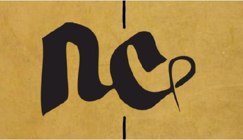
The Haushala logo, designed in a calligraphic style with the letter "ha" in Devanagari script, faces a readability challenge. When applied as a label on handmade bags, the stylized form unintentionally resembles the lowercase letters "n" and "c" in the English alphabet. This misinterpretation can lead to confusion among viewers unfamiliar with the intended script, potentially diluting brand recognition and impacting its effectiveness in representing Haushala’s identity.

Haushala’s old hand calligraphy logo, which represents the letter "ह" (‘ha’) of the Devanagari script.

When the logo is flipped counter clock wise the logo reads as lowercase ‘n’ and ‘c’, which is unintended.
Redesigning the Haushala Logo with Intentional Duality
Building on the duality observed in the original logo, I intentionally designed a brand mark that integrates the Devanagari letter "ha" “ह” with the lowercase English letter "e." This deliberate fusion symbolizes both the cultural roots of the brand and its universal message. The letter "e" represents encouragement, the direct translation of the word Haushala, aligning perfectly with the brand’s ethos. This intentional design creates a meaningful, versatile logo that bridges languages and conveys empowerment and optimism.

Iconography for Haushala combines the letter "ह" (“ha”) and the horizontally flipped English lowercase “e” in the negative space.

Final version of the logo

Product labels designs for Haushala

